Thursday 24 April 2014

illustrator ideas

The following are ideas from sketches that i have took further and started to create on illustrator


This design was the one where i had the shape of the logo at the end with the remaining distance placed inside. If i was to go with this design i would have to alter a lot as at the moment i believe it looks a lot to "jazzy" and very "hollywood" which is not the desired effect i am trying to create.


This design on the other hand gives a sense of tradition and class. The only thing that i feel needs to be changed on this design is maybe the colour scheme however if i decide to go with the steel design i feel this fingerpost could be perfect depending on budget alterations.

Thursday 17 April 2014

logo mockup

This is the main logo I have created for Tenbury Wells and I intend to use this throughout the brief.

This is a different variation of the original logo and one that would only be used on steel surfaces linking to the new bins in Tenbury Wells and my fingerpost designs.


Ideas

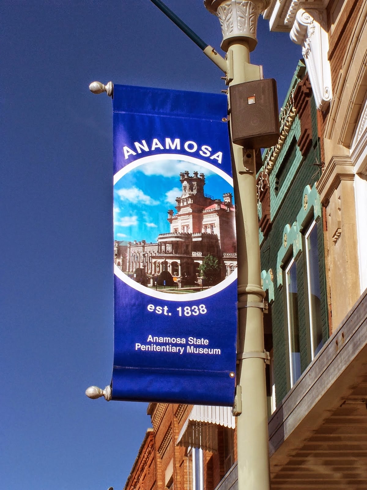
Below are some pictures of the ideas i have come up with. All the designs would follow a colour scheme of Light Blue and a grey/silver colour apart from the finger posts. These colours are the scheme that i have decided to go with throughout this brief.


This type of fingerpost design has to be the one i find most suitable and effective for this Tenbury Wells brief as i feel the semi circular shape on the end of the sign adds a traditional look compared to other designs. If i choose this type of fingerpost i am likely to have the fingerpost wrapped around the pole and I believe the font would look best if it was engraved.


I tried to create a range of different basic logos which i could use within the signage tasks such as the vertical banner and the information board. I feel that by creating a logo it can help me find a certain type of design route to go down and follow throughout the brief. The following designs all tend to be typical logos and quite similar to some football club logos. I felt that it was a good idea to copy these types of logos because they are easy to acknowledge and also get used very widely. Another reason is because it brings a sense of branding to their town and i felt that this could be a benefit when using it for Tenbury Wells.


The following idea shows the incorporation of a logo on both a banner and an information board. Personally this is a technique i like and believe can be effective if used correctly. On the vertical banner the idea is to use minimal type as one of the focal audiences are drivers who have not got the time to read a lot of text. The text would be kept brief and say "welcome to tenbury wells" with the logo shaped at the top. I also planned for the logo to break the mould of the original rectangular shape banner adding emphasis to the logo. This same design is used for the information board however the logos shape will remain but inside the logo will be a map rather than the logo. I feel by keeping a similar sort of design it would look professional in the village of Tenbury Wells.

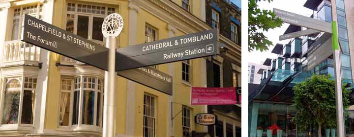
The fingerposts here are in a triangular shape at the end pointing in the direction of which the place is. also their is space for a colour on the end of the post which would demonstrate which type of "point of interest" it is e.g shops, monuments, toilets, infortmation etc. Also on this page I have an information board idea with a map in a traingular shaped pattern at the bottom of the board. I think this idea could work but one of its flaws is the positioning of the map and i believe it is too low considering it is the main point of the board to inform tourists.

The theory behind these ideas is to keep a triangular based pattern. I think this can work as in the modern world of signage all sorts of shapes are used however i believe triangle is fairly simplistic meaning it would keep locals happy and also reach out to people passing by Tenbury Wells. The information board and the banner match well however the design of the pyramid fingerposts may be something which i may alter if decide to go through with this idea. I feel that the fingerposts will be too bulky to be on the streets of Tenbury and there is also a lack of tradition with fonts and shapes.


This is also one of my favourite designs as i feel three - fingerposts, information board and banner compliment each other in terms of design. Another thing that i like about this design is that i can actually see all three of these being built and placed nearby. The logo would be placed at the bottom of the information board and their is a triangular divide for the map and key. There is room for customisation on the fingerposts as there can be added colour key on the edges of the fingerpost to match the key of the information board. Also in the bottom right hand corner are some more fingerpost designs where i plan to use the shape of the LOGO on the end but would be blanked out and have the distance remaining placed inside.


Another idea i came up with is having the logo placed on top of the fingerpost as well as being incorporated into the banner and info board however i do not want to overuse the logo as it isn't an important feature in this brief. However the old style font and the inclusion of the distance remaining on the fingerposts is something which i will take into careful consideration when designing the fingerpost. Also another design of a very basic banner mainly aimed at drivers.


The first of the three is a long and thin design with classic font and space or a colour code at the bottom of the sign linked to the map on the information board. The second design is more of a traditional and old design and actually looks a bit more like a street sign rather than a fingerpost. The third and final finger post is meant to be made out of steel and have black engraved text in helvetica style font. Again the edges may or may not be used for colour coding

this was a little idea i had with having an actual finger pointing in the direction of the place shown. the idea was for the whole thing to be made out of wood but the chances of me going with this idea are highly unlikely

This idea is more of an expensive one and unique one mainly relating to the information board. The idea behind this is to have a cylinder shaped board for my design to wrap around. The main focal point would be the map which would be placed in the middle along with the key underneath. the left side would have a welcome to tenbury wells sign and the right side would have information about the small village

The banner and information board follow the same designs however the problem with the banner is that the text would be slanted meaning it is harder to read for drivers going past. Apart from this i think the design aspects are ok, however if i were to go with this idea i may alter the fingerpost design to a basic rectangle one instead of a triangular shape.

The following design ideas are basic ideas related to the information boards. All three follow the same sort of shape but have different designs in terms of where the map is placed and font types. The design to the right would use more modern font and a theme of blue and silver where as the on on the far left has orchards or mistletoes dangling onto the board and would use a classic font such as Baskerville for headings.


research vertical banner

this is a banner for the town of islington who are promoting the fact that they are the first borough to introduce 20 mph limits. this banner is simple and effective, its quite smart with a corporate look however it is easy to read and you can tell the main job for this banner was to get the message across quickly to drivers with a sense of proudness. this banner shows that lack of words is important for vertical banners so that it is clear and easy to read for people traveling past. it is also important to make use of the lower case and upper case letters as it is easier to read when using lower case as we recognise words easier.

this vertical banner is representing a museum and is very clear in doing so. The design of the banner it self is quite basic and tidy however nowadays it would be considered very easy to make and quite boring. it looks like a standard template from powerpoint or publisher. however the simplicity of the design is something which is once again effective due to where these banners are located on roadsides. 

 this banner is my favourite and the design of it is very unique. An advert for the whisky brand Jack Daniel's it uses a very clever way of making a vertical banner interesting - by not being a vertical banner. They have used metal poles to represent guitar strings and have simply placed a guitar pick in between which is used to advertise Jack Daniels. although it can be argued this doesn't have a lot to do with Jack Daniels almost any brand can use this and argue that music is related to their product. Jack Daniel's can argue people drink whisky sociably when they are out partying listening to music. the idea of creating something as different and unique as this would be good however due to budget constraints and because we are representing a small village in the orchards it wouldn't be as suitable.
the last vertical banner is advertising a new tramline coming into town. the design is fairly basic but has good elements such as transparency of logo and the positioning of images. the writing however seems to be fairly small and the headline is "i love leith" which isn't very clear to people who don't recognise leith as a town although this shouldn't be a problem due to where it is situated. however for drivers it is hard to make out what is being advertised as the picture looks to be pointing towards the building rather than the tramlines. the problem with this banner is clarity and this is something i must be aware of when making my banner for tenbury.

Research Information Boards


This is a modern information board for swindon town football club. as you can see the colour coded areas and icons on the map make it very easy to understand even for people overseas which is very important for this type of board incase swindon ever play any foreign teams. It is very basic yet does the jobs it needs to. something similar to this could be ok for my tenbury brief however i feel i could add more style to it in terms of shape and design.


this is an interesting shape and design of an information board which represents an old monument. its very modern and completely contrasts with what it is showing however it is still designed nicely and colours compliement each other very well. I believe this piece could be quite costly to make however due to all the different 3d shape structures however it is very effective and still does the basic bits aswell as looking pretty

this particiular board shows water meadows and has a lot of information on there. it is a more traditional and old style board with a lot of information compared to modern ones. there might be a bit too much information on there that maybe could be summarised however even tho it is old there are still some design concepts such as the text wrapping the picture. design wise there isn't much i can take from this type of board apart from to remember information is still key


this is another basic and old information board but is designed better than the other one. a lot of thought must have gone into this years ago as the shape was probably considered different back then along with the style of font for the headline title "marple" there are two colour coded maps which look fairly easy to read and there is also a key on the right. even after many years this information can still 
be used and interpreted for visitors however could do with refurbishing.

research finger posts


This fingerpost is probably my favourite in terms of style and shape. it can give off a very unique traditional look but still look modern. this is the perfect impression i am looking to create with my work in this brief as i intend to please the main audience of visitors but keep the local audience happy at the same time.

The style of these finger posts are quite posh and modern and suit higher class towns. For a town like tenbury this may not be as appropriate however the design of the left finger post is one that has certainly caught my eye. the steel structure is something which i may incorporate due to the steel bins arriving shortly in tenbury. the black finger posts look smart and also the use of icons is something which I may look to incorporate into my work.

Although it can be argued that the reason for fingerpost and a lot of information design is mainly for easy accessibility. For people to look at the design and find out the relevant information they need to know in the shortest amount of time possible. So for this picture it can be argued that the fingerposts clearly do the job required in a swift fashion however for my particular brief this would not be the best type of fingerpost. The idea of a colour key is something which i am looking to incorporate with my map and finger post however the amount of colour used for this one is something that i wont be using. It might work for the location it is place but for the brief in tenbury it isnt suitable. Due to tenbury being a small town, it wouldnt be as effect as it would in big city. Therefore i plan to use a subtle colour key compared to this one.