
this is a banner for the town of islington who are promoting the fact that they are the first borough to introduce 20 mph limits. this banner is simple and effective, its quite smart with a corporate look however it is easy to read and you can tell the main job for this banner was to get the message across quickly to drivers with a sense of proudness. this banner shows that lack of words is important for vertical banners so that it is clear and easy to read for people traveling past. it is also important to make use of the lower case and upper case letters as it is easier to read when using lower case as we recognise words easier.
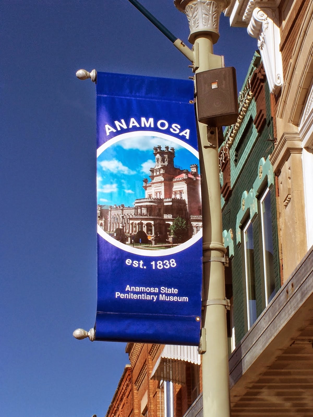
this vertical banner is representing a museum and is very clear in doing so. The design of the banner it self is quite basic and tidy however nowadays it would be considered very easy to make and quite boring. it looks like a standard template from powerpoint or publisher. however the simplicity of the design is something which is once again effective due to where these banners are located on roadsides.


the last vertical banner is advertising a new tramline coming into town. the design is fairly basic but has good elements such as transparency of logo and the positioning of images. the writing however seems to be fairly small and the headline is "i love leith" which isn't very clear to people who don't recognise leith as a town although this shouldn't be a problem due to where it is situated. however for drivers it is hard to make out what is being advertised as the picture looks to be pointing towards the building rather than the tramlines. the problem with this banner is clarity and this is something i must be aware of when making my banner for tenbury.
No comments:
Post a Comment