
This fingerpost is probably my favourite in terms of style and shape. it can give off a very unique traditional look but still look modern. this is the perfect impression i am looking to create with my work in this brief as i intend to please the main audience of visitors but keep the local audience happy at the same time.
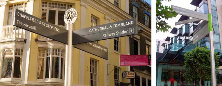
The style of these finger posts are quite posh and modern and suit higher class towns. For a town like tenbury this may not be as appropriate however the design of the left finger post is one that has certainly caught my eye. the steel structure is something which i may incorporate due to the steel bins arriving shortly in tenbury. the black finger posts look smart and also the use of icons is something which I may look to incorporate into my work.

Although it can be argued that the reason for fingerpost and a lot of information design is mainly for easy accessibility. For people to look at the design and find out the relevant information they need to know in the shortest amount of time possible. So for this picture it can be argued that the fingerposts clearly do the job required in a swift fashion however for my particular brief this would not be the best type of fingerpost. The idea of a colour key is something which i am looking to incorporate with my map and finger post however the amount of colour used for this one is something that i wont be using. It might work for the location it is place but for the brief in tenbury it isnt suitable. Due to tenbury being a small town, it wouldnt be as effect as it would in big city. Therefore i plan to use a subtle colour key compared to this one.
No comments:
Post a Comment